From the grand metropolis of Philadelphia emerges DAHSAR, a design brand that has established itself with collaborates with musicians and artists. DAHSAR, a reversal of the first name of founder Rashad Rastam, joins recently forces with Commercial Type, a type foundry founded by Christian Schwartz, which is based in both New York City and London. Commercial Type’s offerings include shirts designed by Peter Saville.
Saville, an icon in the graphic design world, created many of the classic 80s album covers for Factory Records. Album collectors and fashionable youth alike will know his Unknown Pleasures design, derived from a picture of radio waves from the first pulsar ever recorded: CP 1919, which was culled by Bernard Sumner from The Cambridge Encyclopaedia of Astronomy. (The image itself was created by radio astronomer and PhD student Harold Craft at the Arecibo Observatory.) Saville also designed truly iconic work for New Order, Roxy Music, Orchestral Manoeuvres In The Dark, Peter Gabriel, and Pulp.
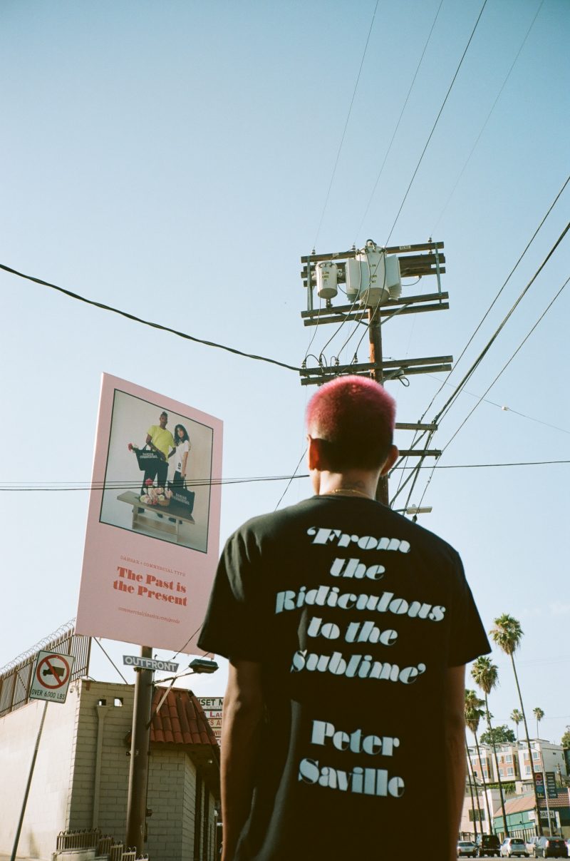
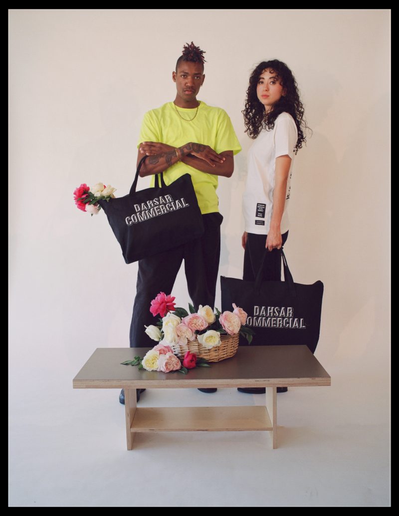
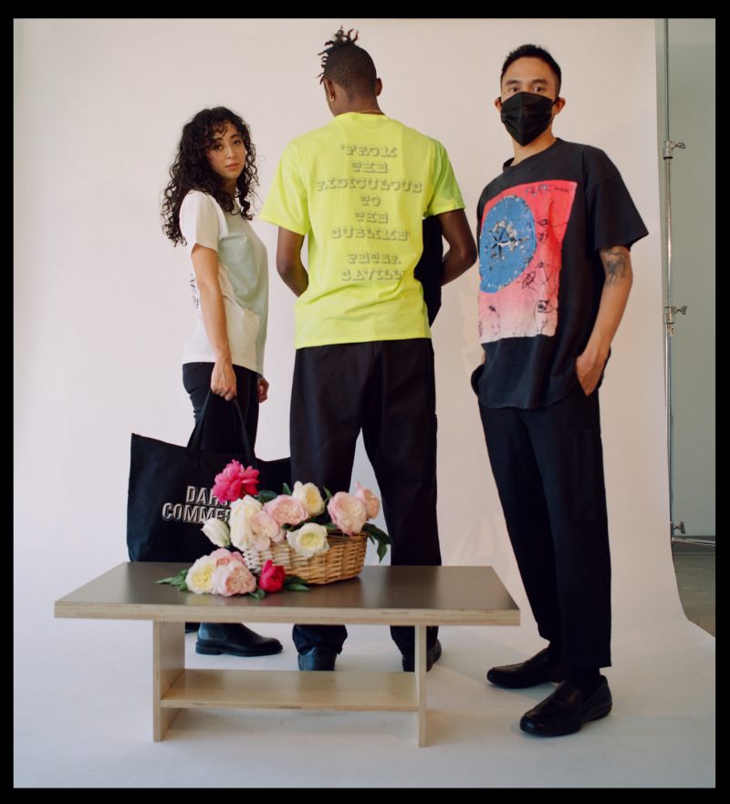
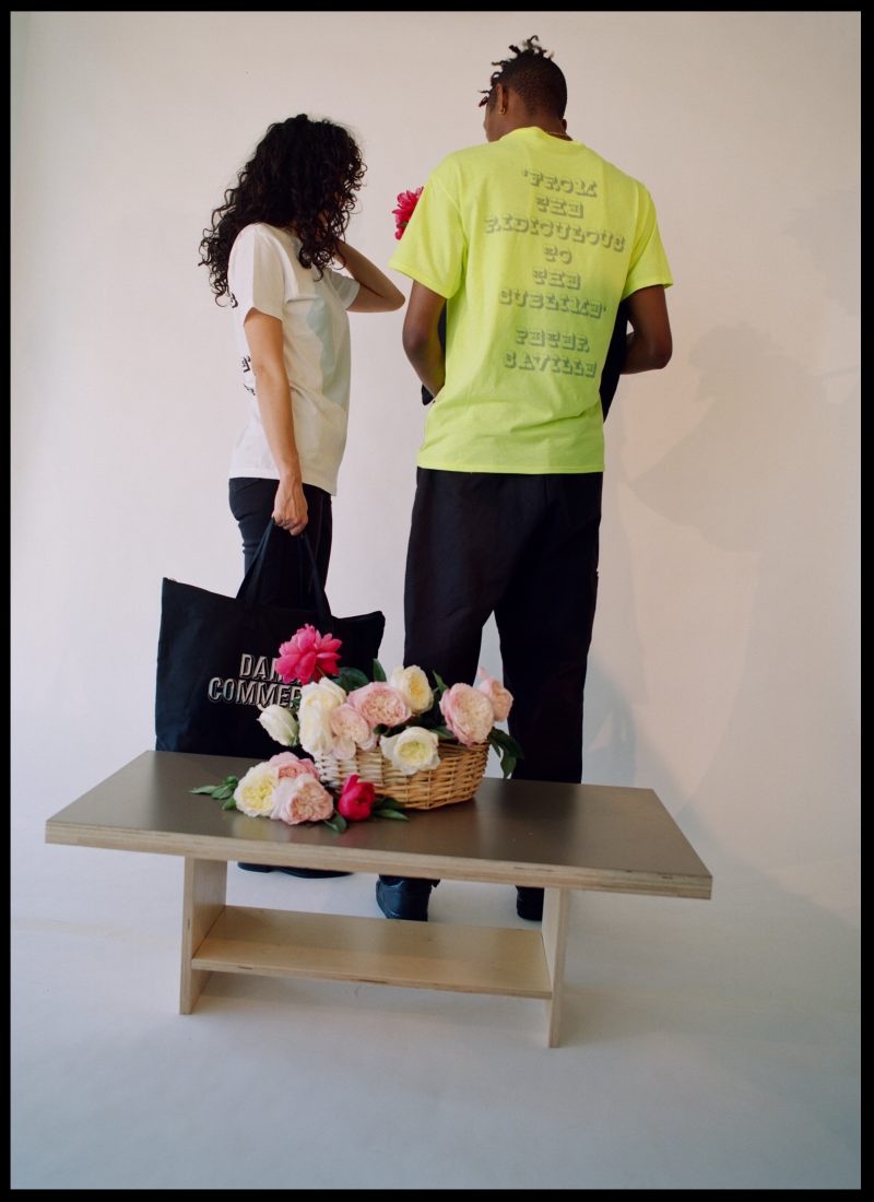
Following the success of their last collaboration, entitled Inflection Point, this union brings some of the iconic typefaces revived in the Commercial Classics to life in a second capsule collection, entitled The Past Is The Present. In December 2020, the pair collaborated with Fraser Muggeridge Studio on an installation of billboards around several neighborhoods in London. “Several of these used a quote from Peter Saville, describing Commercial Classics: “From the ridiculous to the sublime.” With his blessing, we have immortalized this quote on t-shirts,” says Schwartz.
Post-Punk.com was intrigued by this endeavour, so we spoke with the designers about the impetus behind this collection, their inspirations and tastes, and their hopes.
Tell us a little about your background as a designer.
Christian Schwartz: I’m a type designer who originally wanted to design magazines but quickly figured out that my skills are better suited to making the ingredients for graphic design, not necessarily putting all of the parts together. I’ve been based in New York since 2002, and I’ve been working with my business partner Paul Barnes in London (long-distance) since 2003. I’ve known Rashad since 2017, and we started collaborating in 2018.
Rashad Rastam: I’m a creative producer and art director that once was a graphic designer. I am from Philadelphia, now based in NYC. I created Dahsar in 2012 and have worked a lot of different gigs since. We work with bands, brands, artists, and other creatives of what they want to make come to life.
What inspired you to create this particular collection? How is it the same or different from other collections or, if you’ve done them before, collabs in the past?
Rashad Rastam: Dahsar is all about collaboration. With my background as an Art Director, Dahsar has always been working with typography. As a creative producer we found the next best collaboration within our realm that symbolizes and encompasses all of what we like to create. I’ve always wanted to play with type and borrow lyrics that stand out to me to use on any type of surface. To collaborate with Commercial Type and Chrisitan Schwartz was a fever dream. To have a piece designed by Peter Saville was not in the cards.
What Factory Records artists do you connect with the deepest?
Christian Schwartz: New Order was my introduction to Factory Records, and I branched out from there. I come back to ESG often (my daughters, who are almost 5 and almost 2, love “Dance”), and never get tired of either the Joy Division album, “Looking from a Hilltop” by Section 25, or the first couple of albums from A Certain Ratio.
Rashad Rastam: Joy Division was always the one I connected with. Growing up and going to all my favorite dive bars in Philly such as Tattooed Mom, The Barbary, and El Bar would always play Joy Division. New Order immediately after. I never knew you could play such sad music to dance to. The other Factory Records artists to follow were The Wendys and The Wake. Me and Christian saw ESG together and that was a good memory.
What album sleeves from the Manchester label resonate with you most?
Chrisitan Schwartz: Out of all of the great Factory sleeves, I think my favorite is New Order’s “Power, Corruption, and Lies”. The juxtaposition of Henri Fantin-Latour’s painting with the mysterious code… it’s brilliant. Section 25’s “Always now” is another favorite. Saville has a way of adding mystery when he quotes from different visual sources.
Rashad Rastam: New Order’s “Power, Corruption, and Lies” and how it translates each and every time someone does a collaboration or licencing with it on a collection of products they are using it for. I once gave a birthday gift of the “Power, Corruption, and Lies” as a hoodie and it was one of the best birthday gifts I’ve ever given.
Are you a fan of Factory Benelux and Les Disques du Crépuscule?
Rashad Rastam: I’m a fan of Factory Benelux because it reminds me of Commercial Type’s Commercial Classics, where they both share they’re classic catalogue and special editions.
What other post-punk, new wave, and shoegaze bands are your favorites?
Christian Schwartz: Gang of Four and My Bloody Valentine are the two bands I always come back to. My parents were really into New Wave when I was a kid, so I grew up on Talking Heads, Devo, and the B-52’s (my mom’s favorite). A friend in college got me into my bloody valentine but I somehow missed out on shoegaze the first time around, but my husband later got me into Slowdive and Lush.
Rashad Rastam: My Bloody Valentine, The Cure, Slowdive, Suicide, Bauhaus, Echo & the Bunnymen, Cocteau Twins, The Jesus and Mary Chain, Ride, Catherine Wheel, Drop Nineteens, for some in the past. Black Marble, Cold Showers, Tamaryn, Choir Boy, Soft Kill, Death of Lovers, Film School, Drab Majesty, and Chain of Flowers.
What are your thoughts on Vaughn Oliver’s work with 23 Envelope and 4AD, for example?
Christian Schwartz: Vaughan Oliver’s work has been hugely influential on me. My graphic design education was heavily influenced by Swiss Modernism, and I was taught that clear communication was the entire purpose of graphic design. 23 Envelope/v23’s painterly imagery and complex typography was a whole other world, using typefaces I never would have dreamed of combining (most of which I wouldn’t have even used on their own), designed for a small, specific audience and seemingly unconcerned about alienating people.
Rashad Rastam: Vaughn Oliver’s whole body of work is brilliant. 4AD wouldn’t be 4AD without his work.
Are there other graphic designers integral to Goth and Post-Punk you admire?
Christian Schwartz: Malcolm Garrett was great, and Barney Bubbles was a little more hit and miss for my taste but never boring. I feel like Bráulio Amado is kind of the contemporary heir to Vaughan Oliver, Barney Bubbles, and Malcolm Garrett, less for his style than his approach: willing to design sleeves that are mysterious or hard to read, with weird imagery that is often sublimely beautiful.
Rashad Rastam: I’m going to say my favorites out there are my friends Kelsey Niziolek and Lia Kantrowitz.
Do you have any album sleeves, band logos, or other artwork from the post-punk scenes that are your favorite?
Christian Schwartz: Tibor Kalman’s sleeve for “Remain in Light” by Talking Heads still resonates.
Rashad Rastam: The discography of The Cure.
Do you think a powerful visual aesthetic, whether it be hair and makeup, or clothes, or graphic design, is an essential part of the presentation along with the music?
Christian Schwartz: Yeah, I think visuals are important. Even not putting effort into a look is a choice that helps communicate what a band is about.
Rashad Rastam: If I said no that would be a lie.
How did the collaboration with Peter Saville happen? What was it about him, or your output, that drew you together?
Christian Schwartz: Paul is a friend and close collaborator of Peter Saville’s, and this was the second time he worked on something for Commercial Type—the first was a poster for our typeface Graphik. Paul was supposed to spend the spring of 2020 on tour promoting Commercial Classics, our library of revivals of 19th century British typefaces, giving lectures across the US, Canada, and Australia. Peter had agreed to design a tour t-shirt for us. We initially postponed the tour by a couple months when everything started to shut down, then pulled the plug completely. At first we talked about still making a shirt for a tour that never happened, but the joke didn’t seem funny as the pandemic dragged on, so we came up with a new idea altogether, adapting the quote from a series of billboards we put up in London last Christmas, in collaboration with Fraser Muggeridge.
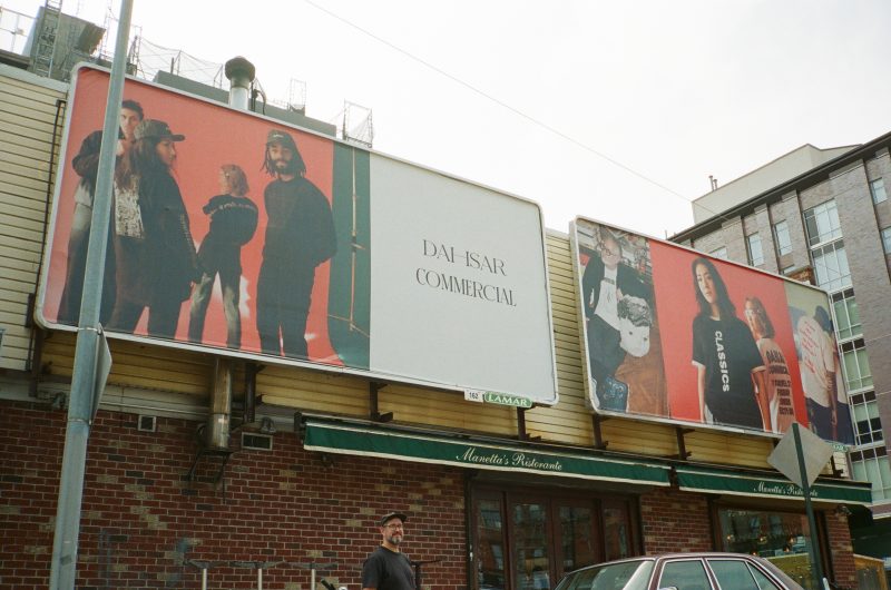
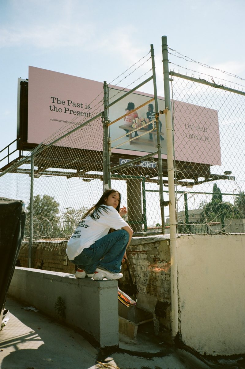
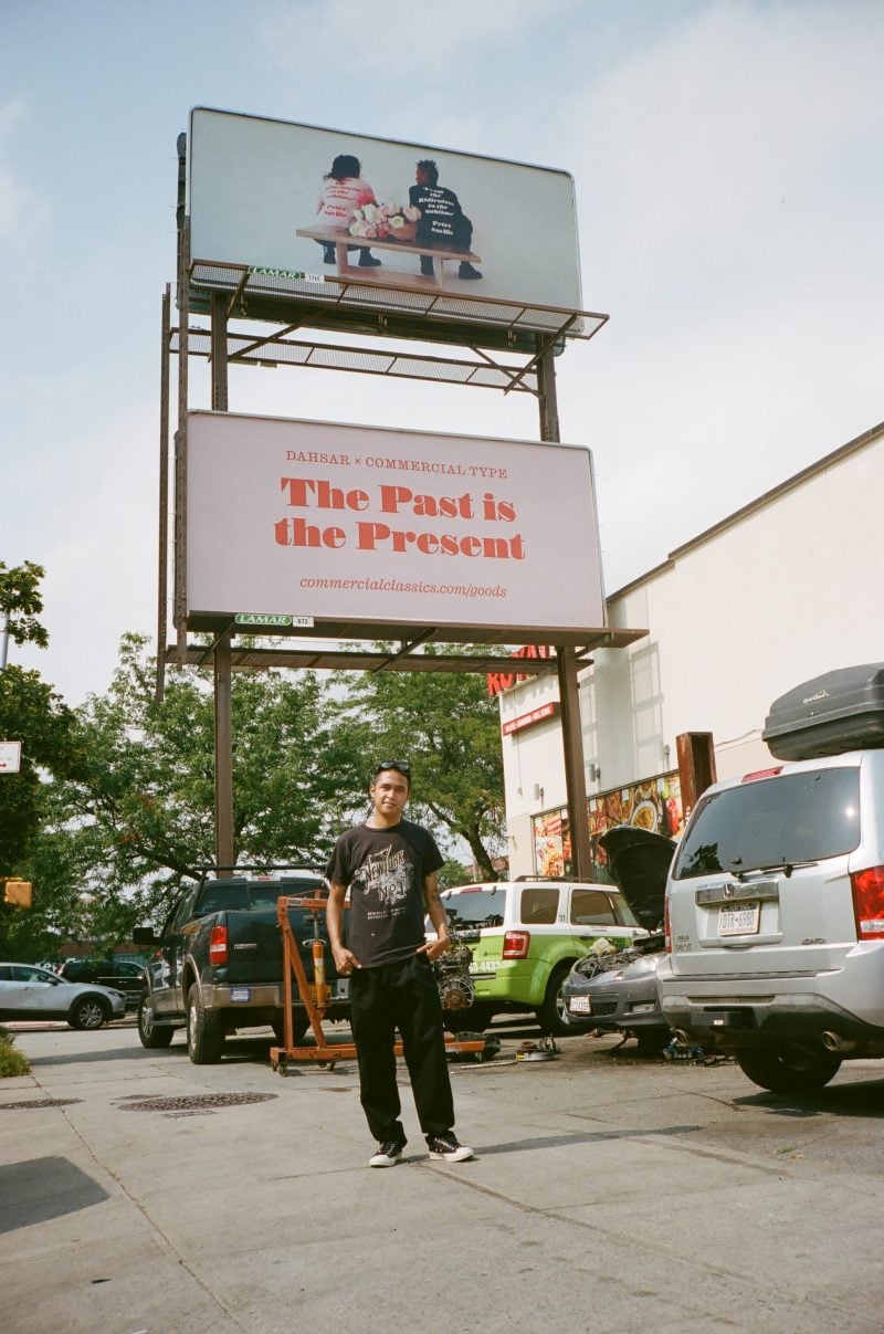
Rashad Rastam: After the series of billboards in London came the idea of having billboards in the states. Two billboards in Los Angeles showcasing the Peter Saville collaboration, and then 4 billboards in New York City that reflected our collaboration as a whole.
What is it about the “from the ridiculous to the sublime” quote that inspired you to adopt it for this collection?
Christian Schwartz: This was Peter’s reaction when Paul showed him the full set of typefaces we were finishing for Commercial Classics, and we thought it was a perfect summation of the ethos of the project. Some of the typefaces are really bizarre, and some are undeniably beautiful.
What message are you hoping to share with this collaboration?
Christian Schwartz: Commercial Classics is about recontextualizing historical typefaces in contemporary graphic design, showing that these aren’t just museum pieces, but that they are still relevant. Apparel felt like a natural extension of this idea, and Rashad expertly selected which typefaces to feature and how best to bring them to life. The past is the present.
Rashad Rastam: Dahsar has the ability to Wear Many Hats. We were able to go beyond streetwear and start a studio within the process. Christian allowed us to take all that we knew from previous work and trusted us. We hope this never ends and continue to work with Commercial Type in the future. Inflection Point, The Past is the Present, and From the Ridiculous to the Sublime.
For more information visit Dahsar and Commerical Type.
Follow Dahsar:








 Or via: